Home Page Redesign
Done for NewAgeSysIT
Role
Principal Product Designer
Team
- 2 Full-Stack Developers
- 1 Lead Brand & Product Designer
- 1 SEO Strategist
Timeline
1 month
Stack
Figma, Photoshop
After Effects
Just me and a blank canvas
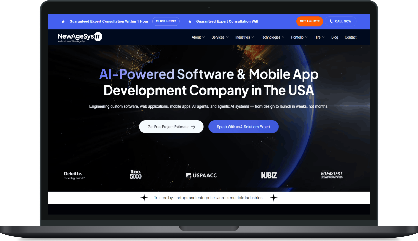
I worked closely with Sanath, our SEO manager, to completely change how NewAgeSysIT.com looks. He came to me with a clear problem: all our competitors had better-designed homepages that clearly showed what they did through visuals. Plus, with AI taking over the service industry, we could no longer look the part. He wanted us to declutter our presentation, add much more strategic whitespace, and build something that actually brought in leads. As the only designer on the project, I took that idea, did the research, and designed the entire thing from scratch. Every single layout and element had a deep strategy behind it — which is exactly the management approved it right away, and it successfully brought in more leads.
My Contributions
- 4 new reusable components.
- Modified design system.
- New UX pattern and interaction.
- Launch campaign assets and visual communication.
- Testing design and creatives to shape the brand identity.
Connecting the dots
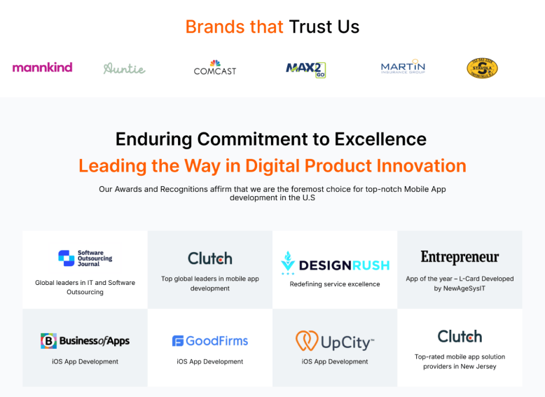
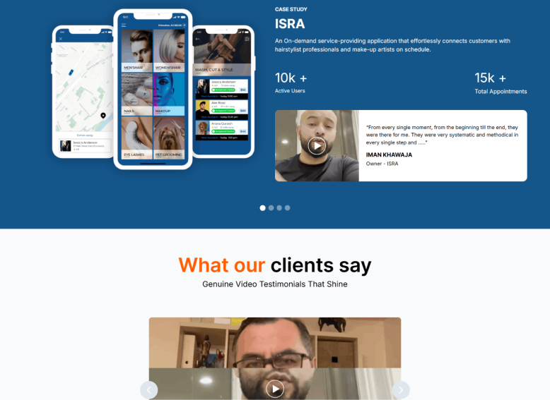
Old Home Page
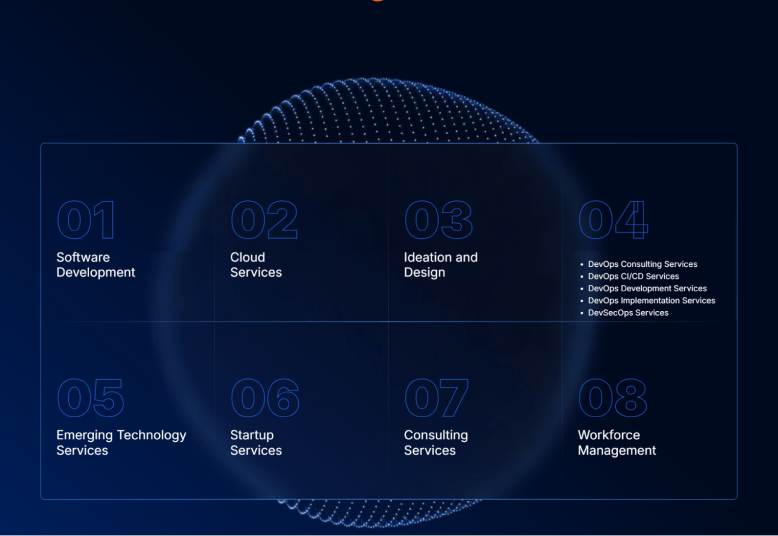
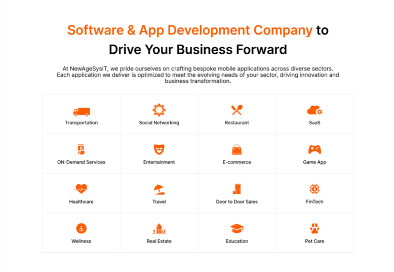
The old page that said too much but showed too little
Our original homepage looked like a basic, text-heavy brochure. It completely failed to show how we were actually implementing AI into our development process—which was a massive problem, especially at a time when clients expected to see AI-driven solutions. Plus, it just felt cluttered and didn't clearly show our focus on the US market. Passersby were just scrolling through uninspiring walls of text instead of converting, meaning we were losing out on valuable business leads.
I gave the entire content layout some much-needed room to breathe by focusing heavily on intentional whitespace. To instantly highlight our AI integration, I brought in futuristic visual elements and swapped out the old static header for a custom hero video featuring a US map to lock in our target audience right away. I also added dynamic sections comparing the actual results of AI-supported development versus traditional development so the value was crystal clear.
But the real game changer was making the experience feel personal. Instead of using generic stock photos, I put real images of our sales heads right onto the page—the exact people leads would be talking to in the next step. Combined with more video elements to kill the static feel and strategically placed CTAs, the page transformed into a highly tailored, balanced experience that finally made sense to management—and more importantly, started bringing in the leads we actually wanted.
Impact
25%
increase in homepage conversion rates within the first month of launching the new mixed-mode layout.
15%
drop in form abandonment. Putting our real sales heads on the page built instant trust.
Final Magic

The Payoff
We launched the new homepage, and the numbers spoke for themselves right away. It didn't just look better—it performed. Within the first 2 months, we saw a 25% increase in high-quality business leads. Plus, because the new layout actually kept people engaged, the average time-on-page jumped by 15% as users stopped to watch the custom video and check out the AI comparison sections.
But the coolest feedback came from our sales team. They noticed that leads coming from the new homepage felt warmer and more familiar during discovery calls, proving that putting our real sales heads right on the page built instant trust. For me, taking this project from a rough idea from Sanath all the way to a live, high-performing asset as the only designer proved exactly what happens when you back up every visual choice with a solid strategy.