Mobile App UI
to improve shopping experience.
Role
Product & UX Designer
Project
Product Design Exercise
Timeline
12weeks
Stack
Figma, Photoshop
Illustrator
How it all started
Everything started when I was rushing to grab groceries for an event that kicked off in an hour. I knew exactly what I wanted and grabbed it all in 15 minutes flat. But then I hit the checkout line. I stood there, trapped, watching the clock tick down for 30 brutal minutes just to pay for a handful of items. By the time I walked out, I had completely missed the event.
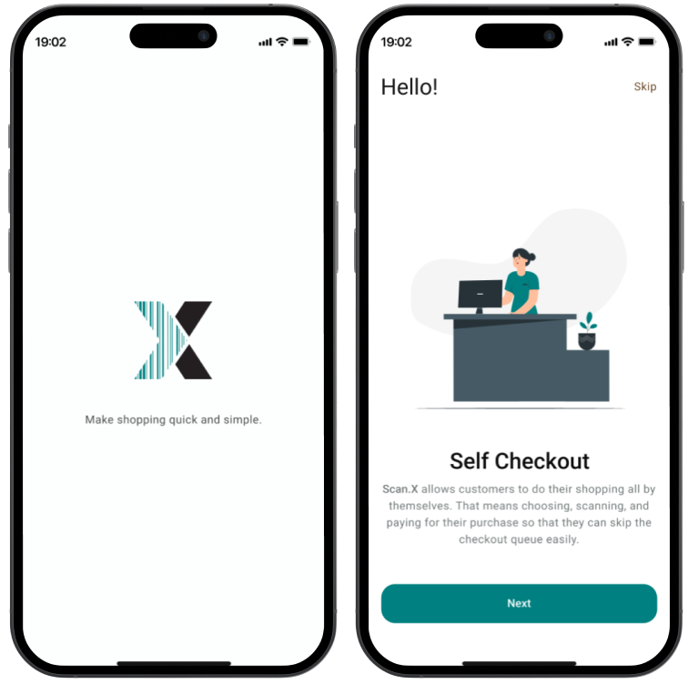
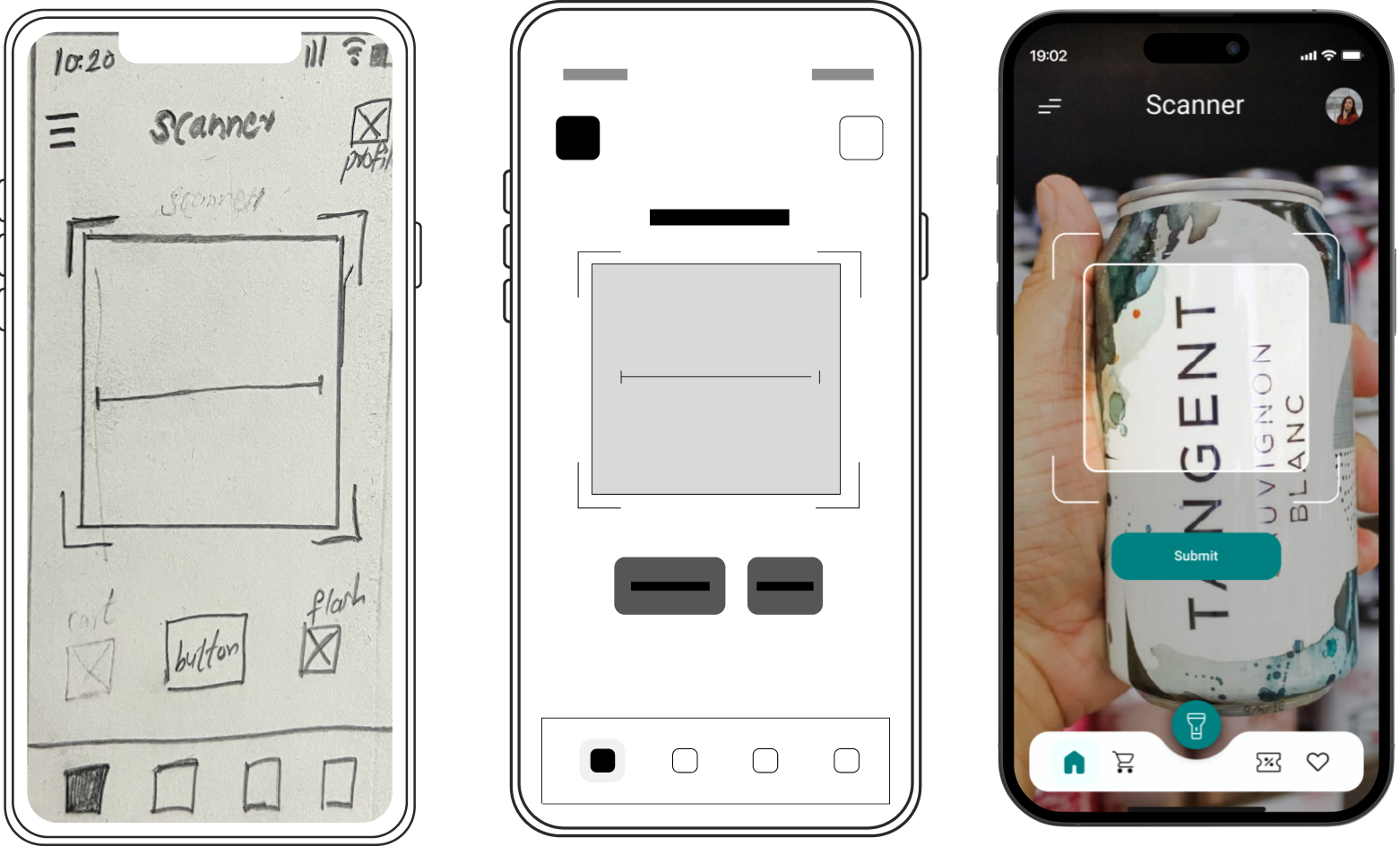
It was frustrating, it was a waste of time, and it made me realize something obvious: retail checkout lines are fundamentally broken, and everyone hates them. But instead of just complaining about it, I decided to tackle this problem completely out of the box. That’s why I built Scan.X—a mobile self-checkout app designed to let users scan barcodes right at the shelf and bypass the register entirely.
The problems I needed to fix
Since this was a personal design sprint, I had total creative freedom to dig deep into the traditional supermarket experience without typical corporate boundaries. I mapped out the three biggest pain points holding shoppers back:
- The Time Trap: Time Trap: People live busy lives. Forcing a user who is in a rush to stand in a stagnant queue just to tap a card is a massive user experience failure.
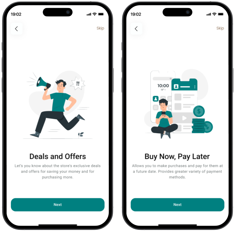
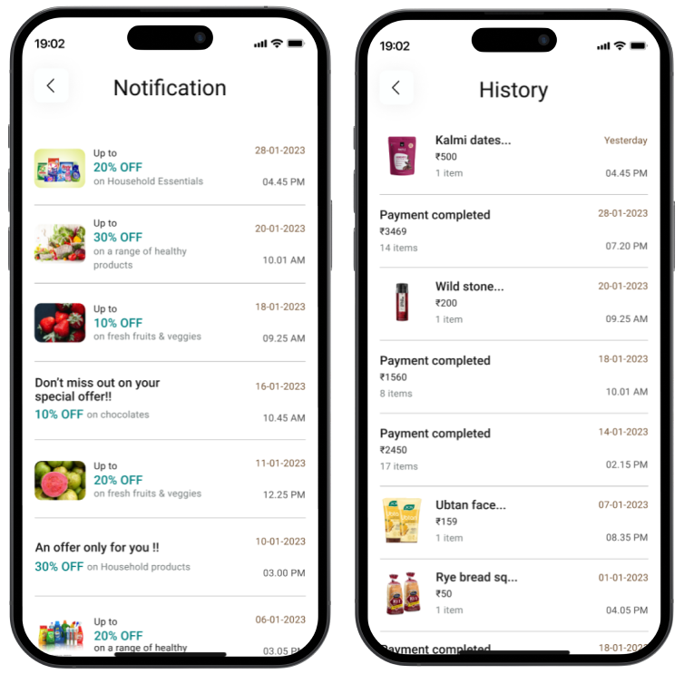
- The Blind Shopping Effect: Stores drop deals and discounts all the time, but shoppers rarely know about them until they happen to stumble across a paper flyer or a tiny shelf tag
- Checkout Surprises: Misplacing items or losing track of the running total leads to friction and anxiety right at the finish line when users realize they spent more than they intended.
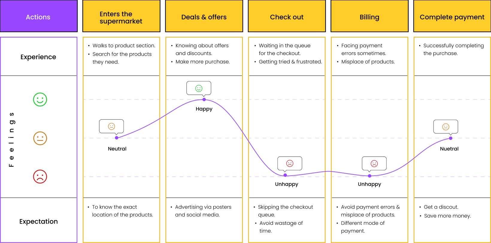
User Journey Mapping
Figuring out what users actually wanted
I didn't want to just guess what users wanted; I wanted my concepts to be rooted in reality. I went out and talked to real people—from busy college students trying to stretch a budget to supermarket floor staff. I combined 1-on-1 deep dives with a digital survey that brought in 35+ raw responses.
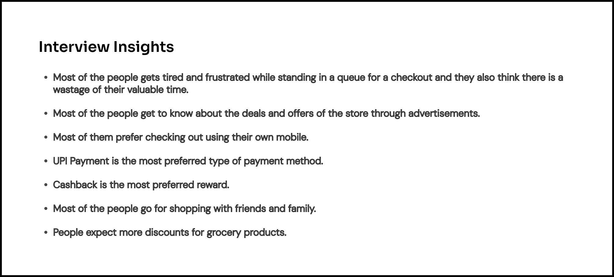
The insights were loud and clear: people loved the idea of scanning items on their own devices, but they needed it to be bulletproof. They wanted a dominant payment method like UPI integrated directly, instant access to cashbacks, and a layout that let them track their cart total in real-time. I stacked these needs against established competitors, mapped out a full SWOT analysis, and used those insights to build my core user persona, Benin—a 24-year-old college staff member who values his limited free time over everything else.
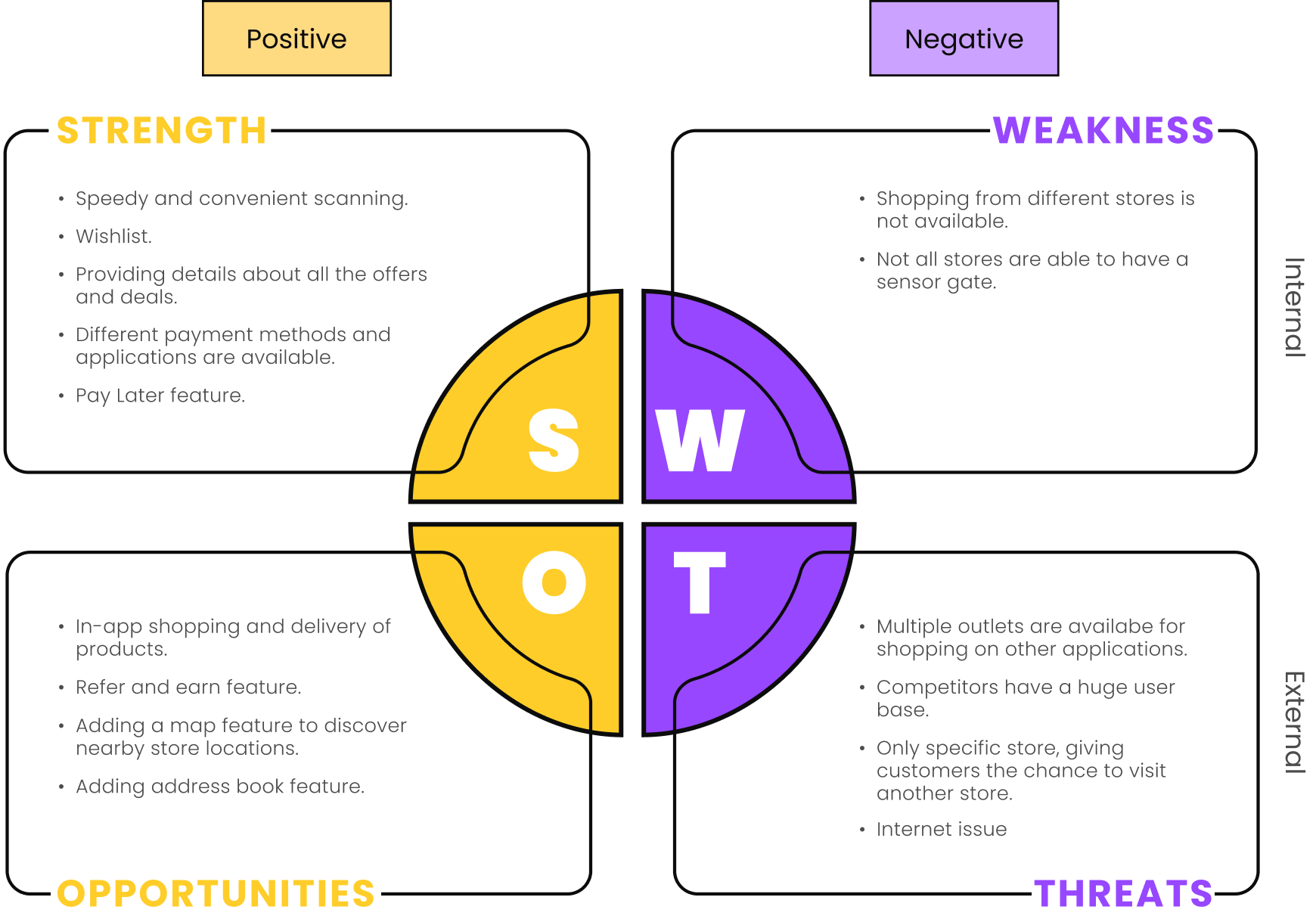
SWOT Analysis
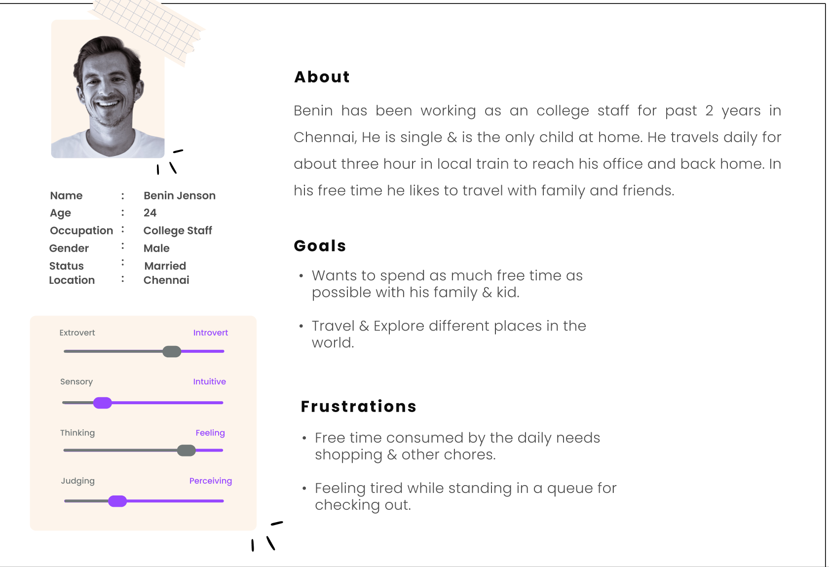
User Persona
Designing the shortcut
To make sure Benin could walk into a store, grab his items, and walk out without a single headache, I designed a streamlined, hyper-focused sitemap built around speed. Instead of burying features under menus, everything is instantly accessible.
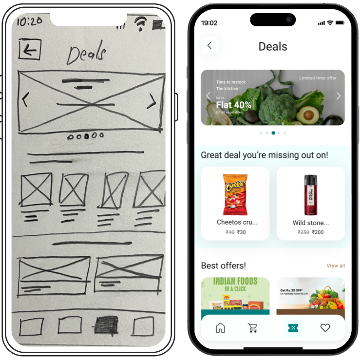
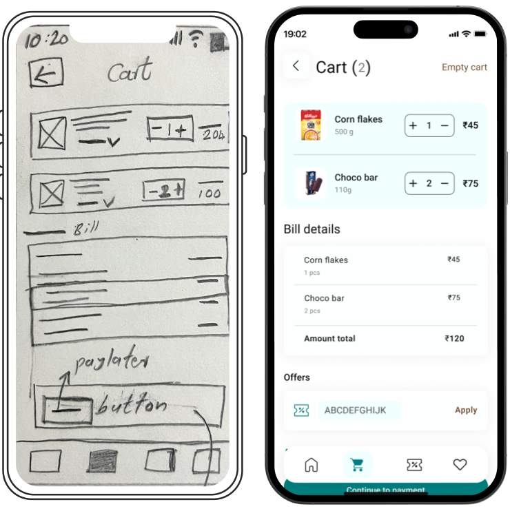
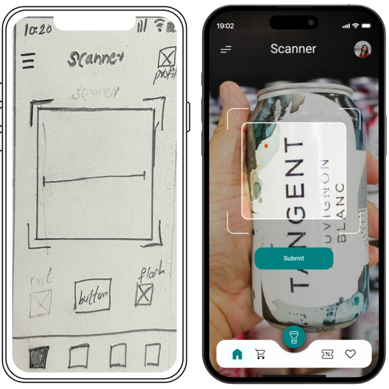
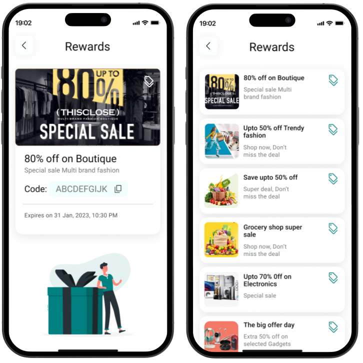
Every single layout and element I designed had a strategic rationale behind it. If a shopper is standing in a dimly lit aisle, they get a one-tap flashlight utility right on the scanning screen. If they want to maximize their budget, the app surfaces high-value coupons right inside the cart before they hit pay.
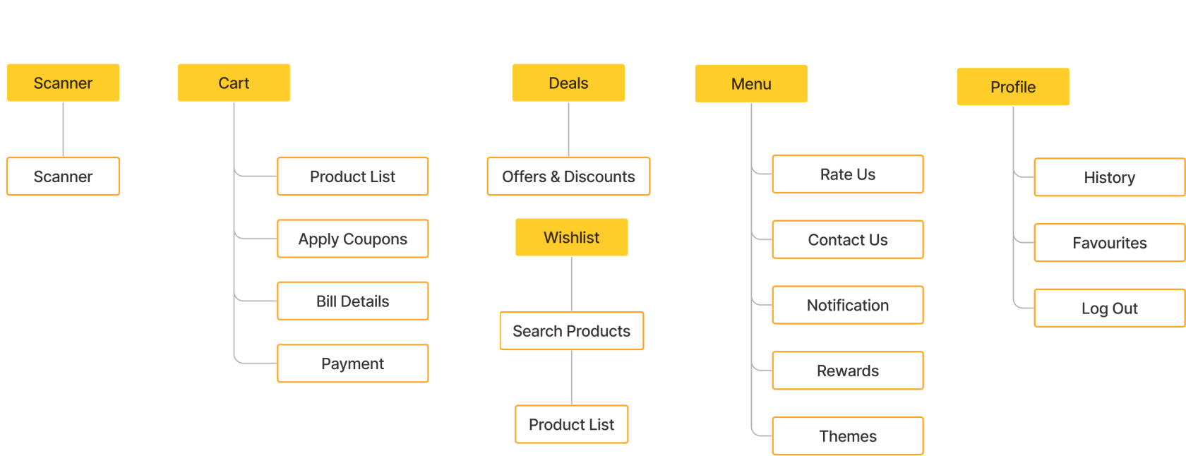
SWOT Analysis
Real-world check: What about shoplifting?
During my deep dives, I ran into a massive design flaw: what stops someone from dropping a steak into their bag without scanning it? I knew that if I designed an app that made it easy to steal, no store would ever use it. While it was tempting to dream up futuristic AI camera systems or expensive robotic gates, I wanted a solution that was simple, realistic, and low-cost:
- No anonymous users: You can’t just use Scan.X as a guest. To scan anything, you have to verify your phone number and link a payment profile up front. Shoplifters rely heavily on being invisible. The moment their real name and identity are digitally tied to their shopping session, casual theft drops instantly.
- The 5-second exit tap: When a user pays, the app generates a single, clean receipt QR code. At the store exit, instead of an expensive robotic gate, a single store associate stands with a handheld staff device. They scan the customer’s QR code, randomly zap 3 physical items in the cart to verify they match the digital receipt, and wave them through. It takes 5 seconds, requires zero new hardware, and keeps the store safe.
The results
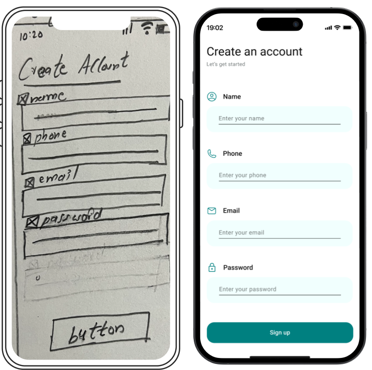
Over an intense 12-week timeline, I took Scan.X from a frustrating personal experience in a checkout line all the way to a fully realized ecosystem spanning 20+ high-fidelity screens. I prototyped the entire flow, put it through rigorous usability testing, and refined the interactions until the process of scanning, paying, and leaving felt entirely seamless. Taking this project from a raw whiteboard sketch all the way to a high-fidelity system as the only designer proved exactly what happens when you have the freedom to take a messy problem and build a solution completely outside the box.